"/><stop offset="1" stop-color="rgb(255, 100, 165)"/></linearGradient></defs><g d="M 0 0 L 60 0 L 60 60 L 0 60 Z M 9 60 C 4.029 60 0 55.971 0 51 L 0 9 C 0 4.029 4.029 0 9 0 L 51 0 C 55.971 0 60 4.029 60 9 L 60 51 C 60 55.971 55.971 60 51 60 Z M 42.974 11.215 C 43.145 11.215 43.331 11.198 43.535 11.164 C 43.773 11.096 44.011 10.942 44.249 10.704 C 44.385 10.568 44.538 10.5 44.708 10.5 C 44.98 10.5 45.184 10.653 45.319 10.959 L 49.347 18.412 C 49.449 18.616 49.5 18.77 49.5 18.872 C 49.5 19.144 49.364 19.348 49.092 19.484 L 46.951 20.658 C 46.747 20.76 46.577 20.811 46.441 20.811 C 46.237 20.811 46.05 20.658 45.88 20.352 L 45.727 20.046 C 44.878 18.344 43.654 17.136 42.057 16.422 C 40.46 15.707 38.624 15.349 36.551 15.349 L 34.053 15.349 L 34.053 41.588 C 34.053 42.949 34.308 44.106 34.818 45.059 C 35.327 45.978 36.228 46.437 37.519 46.437 L 37.876 46.437 C 38.386 46.437 38.641 46.692 38.641 47.203 L 38.641 48.734 C 38.641 49.245 38.386 49.5 37.876 49.5 L 22.174 49.5 C 21.664 49.5 21.41 49.245 21.41 48.734 L 21.41 47.203 C 21.41 46.692 21.665 46.437 22.175 46.437 L 22.481 46.437 C 23.772 46.437 24.673 45.978 25.182 45.059 C 25.692 44.106 25.947 42.949 25.947 41.588 L 25.947 15.349 L 23.449 15.349 C 21.376 15.349 19.541 15.707 17.943 16.421 C 16.346 17.136 15.122 18.344 14.273 20.046 L 14.12 20.352 C 13.95 20.658 13.763 20.812 13.559 20.812 C 13.423 20.812 13.253 20.761 13.049 20.659 L 10.908 19.484 C 10.636 19.348 10.5 19.144 10.5 18.872 C 10.5 18.77 10.551 18.616 10.653 18.412 L 14.68 10.959 C 14.85 10.653 15.054 10.5 15.292 10.5 C 15.462 10.5 15.615 10.568 15.751 10.704 C 15.989 10.943 16.21 11.096 16.414 11.164 C 16.651 11.197 16.855 11.215 17.026 11.215 Z" fill="transparent" height="60px" id="wnIU_RgRP" width="60px"><path d="M 0 0 L 60 0 L 60 60 L 0 60 Z" fill="transparent" height="60px" id="g9vASv_I0" width="60px"/><path d="M 9 60 C 4.029 60 0 55.971 0 51 L 0 9 C 0 4.029 4.029 0 9 0 L 51 0 C 55.971 0 60 4.029 60 9 L 60 51 C 60 55.971 55.971 60 51 60 Z" fill="rgb(254, 254, 254)" height="60px" id="Zi9UWh_Wu" width="60px"/><g d="M 32.474 0.715 C 32.645 0.715 32.831 0.698 33.035 0.664 C 33.273 0.596 33.511 0.442 33.749 0.204 C 33.885 0.068 34.038 0 34.208 0 C 34.48 0 34.684 0.153 34.819 0.459 L 38.847 7.912 C 38.949 8.116 39 8.27 39 8.372 C 39 8.644 38.864 8.848 38.592 8.984 L 36.451 10.158 C 36.247 10.26 36.077 10.311 35.941 10.311 C 35.737 10.311 35.55 10.158 35.38 9.852 L 35.227 9.546 C 34.378 7.844 33.154 6.636 31.557 5.922 C 29.96 5.207 28.124 4.849 26.051 4.849 L 23.553 4.849 L 23.553 31.088 C 23.553 32.449 23.808 33.606 24.318 34.559 C 24.827 35.478 25.728 35.937 27.019 35.937 L 27.376 35.937 C 27.886 35.937 28.141 36.192 28.141 36.703 L 28.141 38.234 C 28.141 38.745 27.886 39 27.376 39 L 11.674 39 C 11.164 39 10.91 38.745 10.91 38.234 L 10.91 36.703 C 10.91 36.192 11.165 35.937 11.675 35.937 L 11.981 35.937 C 13.272 35.937 14.173 35.478 14.682 34.559 C 15.192 33.606 15.447 32.449 15.447 31.088 L 15.447 4.849 L 12.949 4.849 C 10.876 4.849 9.041 5.207 7.443 5.921 C 5.846 6.636 4.622 7.844 3.773 9.546 L 3.62 9.852 C 3.45 10.158 3.263 10.312 3.059 10.312 C 2.923 10.312 2.753 10.261 2.549 10.159 L 0.408 8.984 C 0.136 8.848 0 8.644 0 8.372 C 0 8.27 0.051 8.116 0.153 7.912 L 4.18 0.459 C 4.35 0.153 4.554 0 4.792 0 C 4.962 0 5.115 0.068 5.251 0.204 C 5.489 0.443 5.71 0.596 5.914 0.664 C 6.151 0.697 6.355 0.715 6.526 0.715 Z" fill="transparent" height="39px" id="sJZgEX_6w" transform="translate(10.5 10.5)" width="39px"><path d="M 32.474 0.715 C 32.645 0.715 32.831 0.698 33.035 0.664 C 33.273 0.596 33.511 0.442 33.749 0.204 C 33.885 0.068 34.038 0 34.208 0 C 34.48 0 34.684 0.153 34.819 0.459 L 38.847 7.912 C 38.949 8.116 39 8.27 39 8.372 C 39 8.644 38.864 8.848 38.592 8.984 L 36.451 10.158 C 36.247 10.26 36.077 10.311 35.941 10.311 C 35.737 10.311 35.55 10.158 35.38 9.852 L 35.227 9.546 C 34.378 7.844 33.154 6.636 31.557 5.922 C 29.96 5.207 28.124 4.849 26.051 4.849 L 23.553 4.849 L 23.553 31.088 C 23.553 32.449 23.808 33.606 24.318 34.559 C 24.827 35.478 25.728 35.937 27.019 35.937 L 27.376 35.937 C 27.886 35.937 28.141 36.192 28.141 36.703 L 28.141 38.234 C 28.141 38.745 27.886 39 27.376 39 L 11.674 39 C 11.164 39 10.91 38.745 10.91 38.234 L 10.91 36.703 C 10.91 36.192 11.165 35.937 11.675 35.937 L 11.981 35.937 C 13.272 35.937 14.173 35.478 14.682 34.559 C 15.192 33.606 15.447 32.449 15.447 31.088 L 15.447 4.849 L 12.949 4.849 C 10.876 4.849 9.041 5.207 7.443 5.921 C 5.846 6.636 4.622 7.844 3.773 9.546 L 3.62 9.852 C 3.45 10.158 3.263 10.312 3.059 10.312 C 2.923 10.312 2.753 10.261 2.549 10.159 L 0.408 8.984 C 0.136 8.848 0 8.644 0 8.372 C 0 8.27 0.051 8.116 0.153 7.912 L 4.18 0.459 C 4.35 0.153 4.554 0 4.792 0 C 4.962 0 5.115 0.068 5.251 0.204 C 5.489 0.443 5.71 0.596 5.914 0.664 C 6.151 0.697 6.355 0.715 6.526 0.715 Z" fill="url(%23KbpzL6PmD-1929859876-linear-gradient)" height="38.999999999999986px" id="KbpzL6PmD" width="39px"/></g></g></svg>)
"/><stop offset="1" stop-color="rgb(255, 100, 165)"/></linearGradient></defs><g d="M 42.974 11.215 C 43.145 11.215 43.331 11.198 43.535 11.164 C 43.773 11.096 44.011 10.942 44.249 10.704 C 44.385 10.568 44.538 10.5 44.708 10.5 C 44.98 10.5 45.184 10.653 45.319 10.959 L 49.347 18.412 C 49.449 18.616 49.5 18.77 49.5 18.872 C 49.5 19.144 49.364 19.348 49.092 19.484 L 46.951 20.658 C 46.747 20.76 46.577 20.811 46.441 20.811 C 46.237 20.811 46.05 20.658 45.88 20.352 L 45.727 20.046 C 44.878 18.344 43.654 17.136 42.057 16.422 C 40.46 15.707 38.624 15.349 36.551 15.349 L 34.053 15.349 L 34.053 41.588 C 34.053 42.949 34.308 44.106 34.818 45.059 C 35.327 45.978 36.228 46.437 37.519 46.437 L 37.876 46.437 C 38.386 46.437 38.641 46.692 38.641 47.203 L 38.641 48.734 C 38.641 49.245 38.386 49.5 37.876 49.5 L 22.174 49.5 C 21.664 49.5 21.41 49.245 21.41 48.734 L 21.41 47.203 C 21.41 46.692 21.665 46.437 22.175 46.437 L 22.481 46.437 C 23.772 46.437 24.673 45.978 25.182 45.059 C 25.692 44.106 25.947 42.949 25.947 41.588 L 25.947 15.349 L 23.449 15.349 C 21.376 15.349 19.541 15.707 17.943 16.421 C 16.346 17.136 15.122 18.344 14.273 20.046 L 14.12 20.352 C 13.95 20.658 13.763 20.812 13.559 20.812 C 13.423 20.812 13.253 20.761 13.049 20.659 L 10.908 19.484 C 10.636 19.348 10.5 19.144 10.5 18.872 C 10.5 18.77 10.551 18.616 10.653 18.412 L 14.68 10.959 C 14.85 10.653 15.054 10.5 15.292 10.5 C 15.462 10.5 15.615 10.568 15.751 10.704 C 15.989 10.943 16.21 11.096 16.414 11.164 C 16.651 11.197 16.855 11.215 17.026 11.215 Z" fill="transparent" height="60px" id="ENy7giQS1" transform="translate(-9 -9)" width="60px"><path d="M 0 0 L 60 0 L 60 60 L 0 60 Z" display="none" fill="transparent" height="60px" id="ESka27RLq" width="60px"/><path d="M 9 60 C 4.029 60 0 55.971 0 51 L 0 9 C 0 4.029 4.029 0 9 0 L 51 0 C 55.971 0 60 4.029 60 9 L 60 51 C 60 55.971 55.971 60 51 60 Z" display="none" fill="rgb(254, 254, 254)" height="60px" id="GxreBo0Hb" width="60px"/><g d="M 32.474 0.715 C 32.645 0.715 32.831 0.698 33.035 0.664 C 33.273 0.596 33.511 0.442 33.749 0.204 C 33.885 0.068 34.038 0 34.208 0 C 34.48 0 34.684 0.153 34.819 0.459 L 38.847 7.912 C 38.949 8.116 39 8.27 39 8.372 C 39 8.644 38.864 8.848 38.592 8.984 L 36.451 10.158 C 36.247 10.26 36.077 10.311 35.941 10.311 C 35.737 10.311 35.55 10.158 35.38 9.852 L 35.227 9.546 C 34.378 7.844 33.154 6.636 31.557 5.922 C 29.96 5.207 28.124 4.849 26.051 4.849 L 23.553 4.849 L 23.553 31.088 C 23.553 32.449 23.808 33.606 24.318 34.559 C 24.827 35.478 25.728 35.937 27.019 35.937 L 27.376 35.937 C 27.886 35.937 28.141 36.192 28.141 36.703 L 28.141 38.234 C 28.141 38.745 27.886 39 27.376 39 L 11.674 39 C 11.164 39 10.91 38.745 10.91 38.234 L 10.91 36.703 C 10.91 36.192 11.165 35.937 11.675 35.937 L 11.981 35.937 C 13.272 35.937 14.173 35.478 14.682 34.559 C 15.192 33.606 15.447 32.449 15.447 31.088 L 15.447 4.849 L 12.949 4.849 C 10.876 4.849 9.041 5.207 7.443 5.921 C 5.846 6.636 4.622 7.844 3.773 9.546 L 3.62 9.852 C 3.45 10.158 3.263 10.312 3.059 10.312 C 2.923 10.312 2.753 10.261 2.549 10.159 L 0.408 8.984 C 0.136 8.848 0 8.644 0 8.372 C 0 8.27 0.051 8.116 0.153 7.912 L 4.18 0.459 C 4.35 0.153 4.554 0 4.792 0 C 4.962 0 5.115 0.068 5.251 0.204 C 5.489 0.443 5.71 0.596 5.914 0.664 C 6.151 0.697 6.355 0.715 6.526 0.715 Z" fill="transparent" height="39px" id="ZZtf7bnpg" transform="translate(10.5 10.5)" width="39px"><path d="M 32.474 0.715 C 32.645 0.715 32.831 0.698 33.035 0.664 C 33.273 0.596 33.511 0.442 33.749 0.204 C 33.885 0.068 34.038 0 34.208 0 C 34.48 0 34.684 0.153 34.819 0.459 L 38.847 7.912 C 38.949 8.116 39 8.27 39 8.372 C 39 8.644 38.864 8.848 38.592 8.984 L 36.451 10.158 C 36.247 10.26 36.077 10.311 35.941 10.311 C 35.737 10.311 35.55 10.158 35.38 9.852 L 35.227 9.546 C 34.378 7.844 33.154 6.636 31.557 5.922 C 29.96 5.207 28.124 4.849 26.051 4.849 L 23.553 4.849 L 23.553 31.088 C 23.553 32.449 23.808 33.606 24.318 34.559 C 24.827 35.478 25.728 35.937 27.019 35.937 L 27.376 35.937 C 27.886 35.937 28.141 36.192 28.141 36.703 L 28.141 38.234 C 28.141 38.745 27.886 39 27.376 39 L 11.674 39 C 11.164 39 10.91 38.745 10.91 38.234 L 10.91 36.703 C 10.91 36.192 11.165 35.937 11.675 35.937 L 11.981 35.937 C 13.272 35.937 14.173 35.478 14.682 34.559 C 15.192 33.606 15.447 32.449 15.447 31.088 L 15.447 4.849 L 12.949 4.849 C 10.876 4.849 9.041 5.207 7.443 5.921 C 5.846 6.636 4.622 7.844 3.773 9.546 L 3.62 9.852 C 3.45 10.158 3.263 10.312 3.059 10.312 C 2.923 10.312 2.753 10.261 2.549 10.159 L 0.408 8.984 C 0.136 8.848 0 8.644 0 8.372 C 0 8.27 0.051 8.116 0.153 7.912 L 4.18 0.459 C 4.35 0.153 4.554 0 4.792 0 C 4.962 0 5.115 0.068 5.251 0.204 C 5.489 0.443 5.71 0.596 5.914 0.664 C 6.151 0.697 6.355 0.715 6.526 0.715 Z" fill="url(%23r4oRpS1Kd-703919304-linear-gradient)" height="38.999999999999986px" id="r4oRpS1Kd" width="39px"/></g></g></svg>)
Design Feedback: Why Written Comments Fail and What to Use Instead
“Make it pop” isn’t useful feedback. Learn why written design comments fail and discover methods that actually give you clear, actionable direction.


Jon Sorrentino
Talki Co-Founder
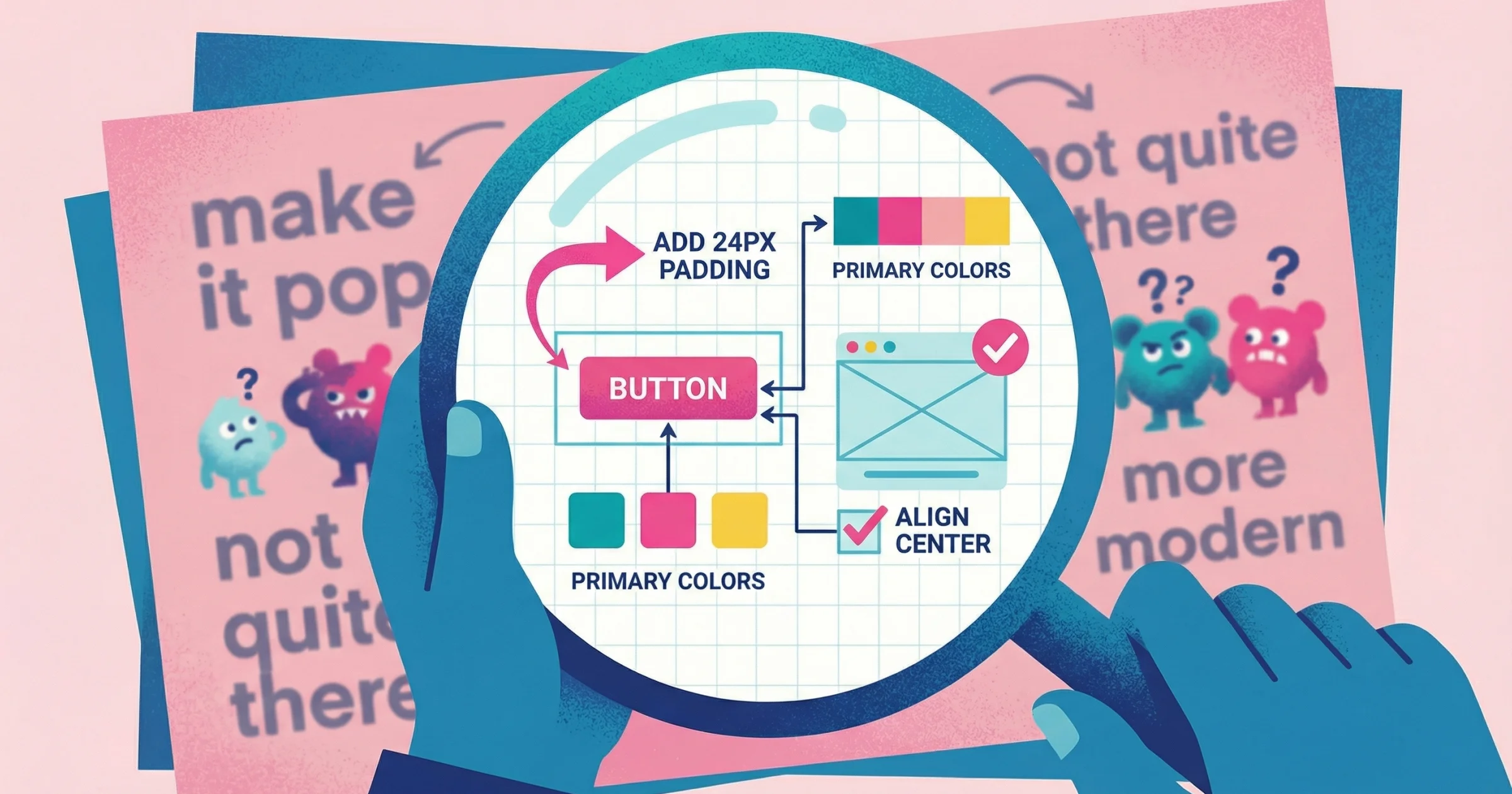
"Can you make it pop more?" "The vibe feels off." "I'll know it when I see it."
If you've done design work for clients, you've received feedback like this. It's not that clients are trying to be difficult—they're struggling to translate visual reactions into words. Design feedback fails when it forces non-visual thinkers to communicate in a medium that doesn't match how they experience design.
I've led design teams at PepsiCo, Barstool Sports, and VICE, and ran a creative studio that worked with hundreds of clients. In my experience, vague feedback like "make it pop" costs teams more than any other communication breakdown. After seeing this pattern destroy project timelines and client relationships repeatedly, I built Talki specifically to solve this problem.
Why Written Design Feedback Creates Problems
Written feedback seems efficient. Client types comment, you read it, make changes, done. But the gap between what clients mean and what they write creates a hidden tax on every project: clarification cycles, misinterpreted revisions, and the slow accumulation of frustration on both sides.
The description problem
Design is inherently visual, but language is linear. When someone tries to describe a visual problem, they're translating from one cognitive mode to another. Most people aren't trained in design vocabulary, so they reach for vague terms that feel right but don't communicate specific information.
Research confirms what designers know from experience: vague communication breeds misunderstanding. Studies show that teams using imprecise terms like "make it user-friendly" without specifics tend to splinter in different directions, resulting in confusion, wasted effort, and subpar results. The core issue is that humans process visual information up to 60,000 times faster than text—so describing visual elements in words is both mentally taxing and inevitably incomplete.
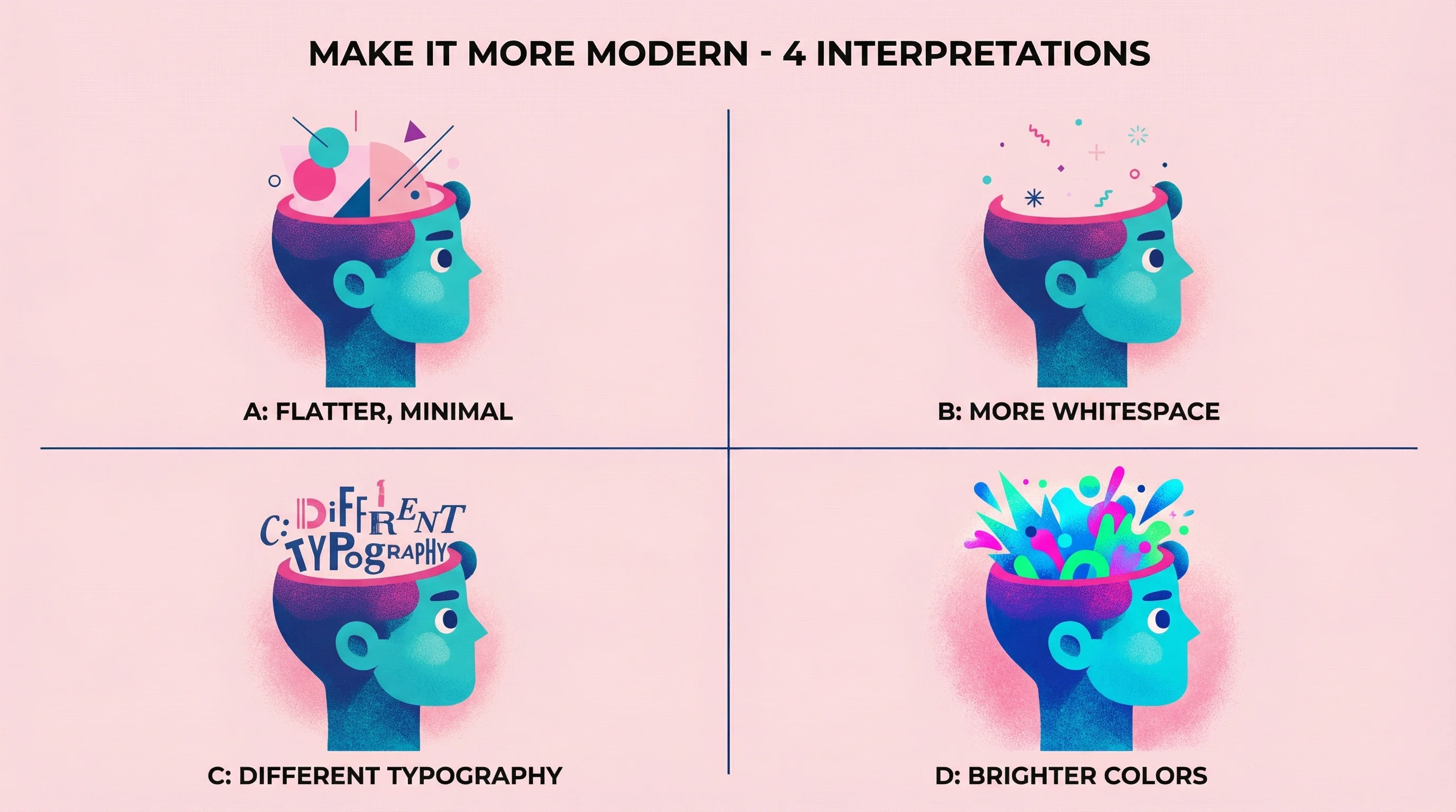
"Make it more modern" could mean: flatter design, more whitespace, different typography, brighter colors, simplified icons, or dozens of other specific changes. Without knowing which interpretation the client has in mind, you're guessing—and wrong guesses cost revision cycles.
The location problem
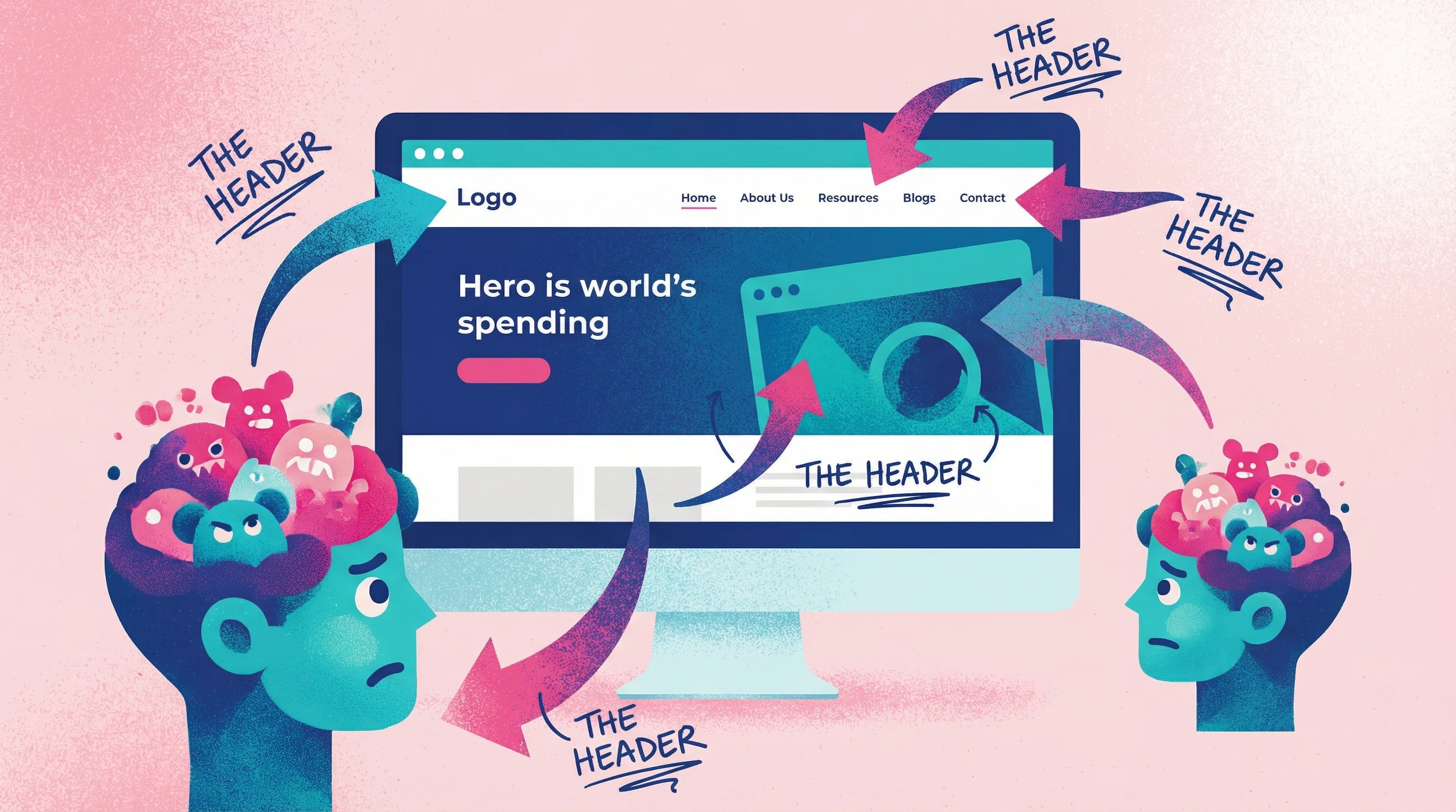
Text comments rarely specify exactly where the problem exists. "The header feels heavy" doesn't tell you if they mean the navigation bar, the hero section, the logo treatment, or the overall top portion of the page. You either ask for clarification (adding delay) or make assumptions (risking wrong revisions).
This location ambiguity is a fundamental flaw in the design feedback loop—one that annotation tools and video feedback were specifically created to solve.
The emotion problem
Design triggers emotional responses that people struggle to articulate. A client knows they don't like something—they feel it immediately—but converting that gut reaction into specific, actionable language requires a skill most non-designers haven't developed.
Communication research shows that nearly 50% of emails are misunderstood because text alone lacks tone of voice and facial context. When giving design feedback, this problem intensifies: clients are not only trying to describe visual reactions, but also convey the emotional weight behind them.
The Psychology Behind Vague Feedback
Understanding why clients give unclear feedback helps you design better collection processes. The issue isn't intelligence or effort—it's a mismatch between how people experience design and how they're asked to communicate about it.
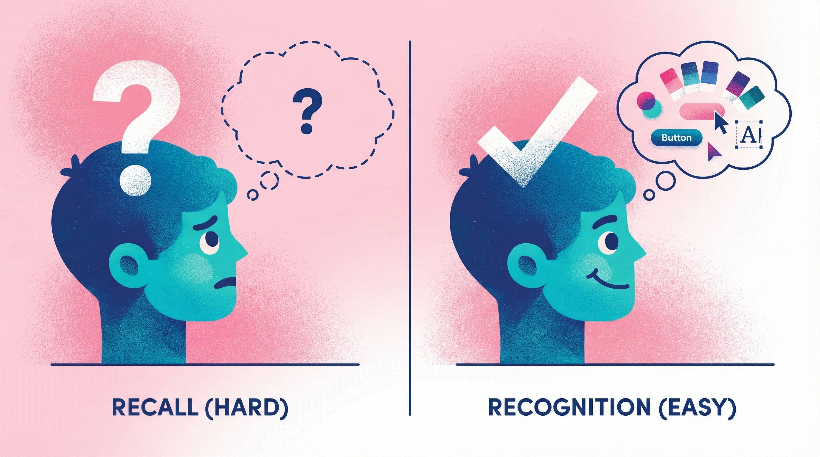
Recognition vs. recall
Humans are far better at recognizing things than describing them from memory. Show someone a color and ask "do you like this?" and they'll answer instantly. Ask them to describe their ideal color without seeing options, and they'll struggle to articulate it.
This cognitive principle is well-documented in usability research. Nielsen Norman Group explains that "recognition is easier than recall because it involves more cues"—people need context to articulate preferences accurately. Studies in decision-making have observed that people often cannot state their criteria in the abstract. They only "learn about their own criteria" by directly comparing concrete options.
Written feedback asks clients to recall and describe their visual preferences. Better feedback methods let them recognize and react: point at this, click that, show you directly.
The curse of expertise
As a designer, you have vocabulary for visual concepts. Kerning, leading, visual hierarchy, negative space—these terms mean specific things to you. Clients lack this vocabulary, so they use whatever words come to mind. "Make it pop" might actually mean "increase the contrast between the headline and background," but without the technical language, they can't say that.
At PepsiCo, we could spend weeks iterating with agency partners on specific parts of a project because someone on the internal team didn't feel like it had enough "energy" or it wasn't to their liking. This was the reality of working at such a large company. On the other hand, I've spent days working independently with my own clients where they can't quite seem to put their finger on what isn't gelling or vibing right. They'll go back and forth with me on multiple rounds of revisions to get a small piece of the project feeling what they feel is "just right." In the end, they have an idea in mind, and they continue sending emails expecting you to understand that idea. Finally, when you get on a call, they're able to point to that exact thing they're looking at or that they have in mind. But they go through this whole rigmarole of trying to coach you to get to that point—to that idea they have in their head.
This isn't a failing on their part. It's a signal that your feedback process needs to meet them where they are.
Cognitive load and avoidance
Giving detailed written feedback is mentally taxing. Many clients delay responding because articulating their thoughts in writing feels hard. When they finally do respond, they keep it brief to reduce the effort—which produces the vague one-liners that create problems downstream.
Research on customer feedback behavior is blunt about this: "If you ask your customers to think too much…they're not going to tell you what they think." The principle aligns with cognitive load theory—people have limited mental resources, and excessive demands cause them to disengage entirely. As one feedback expert observes, "It's human nature to refrain if you can't articulate" your thoughts readily.
Lower the cognitive load, and you get better feedback faster.
Better Alternatives to Written Comments
The solution isn't training clients to write better feedback. It's giving them feedback collection methods that match how they naturally think about design.
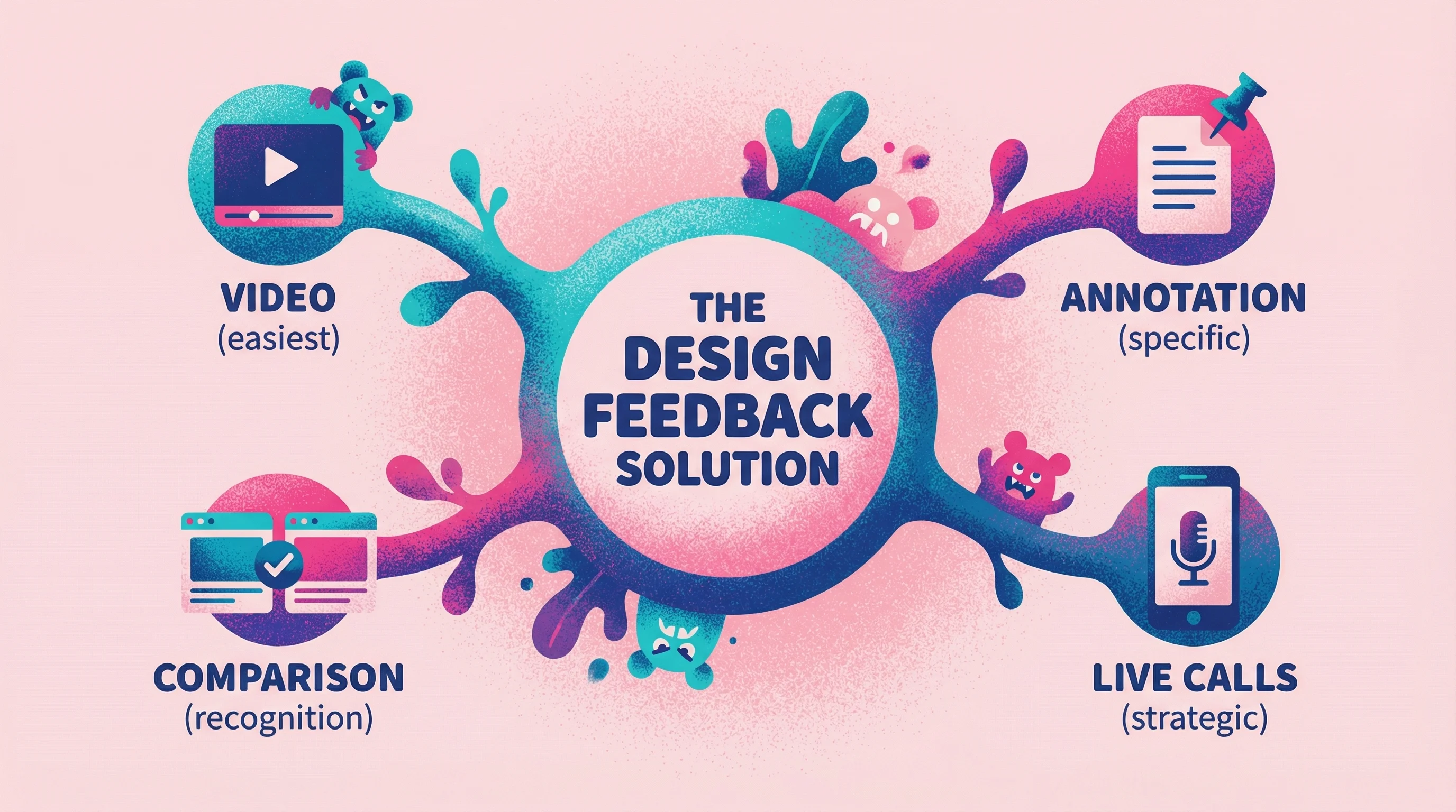
Video feedback
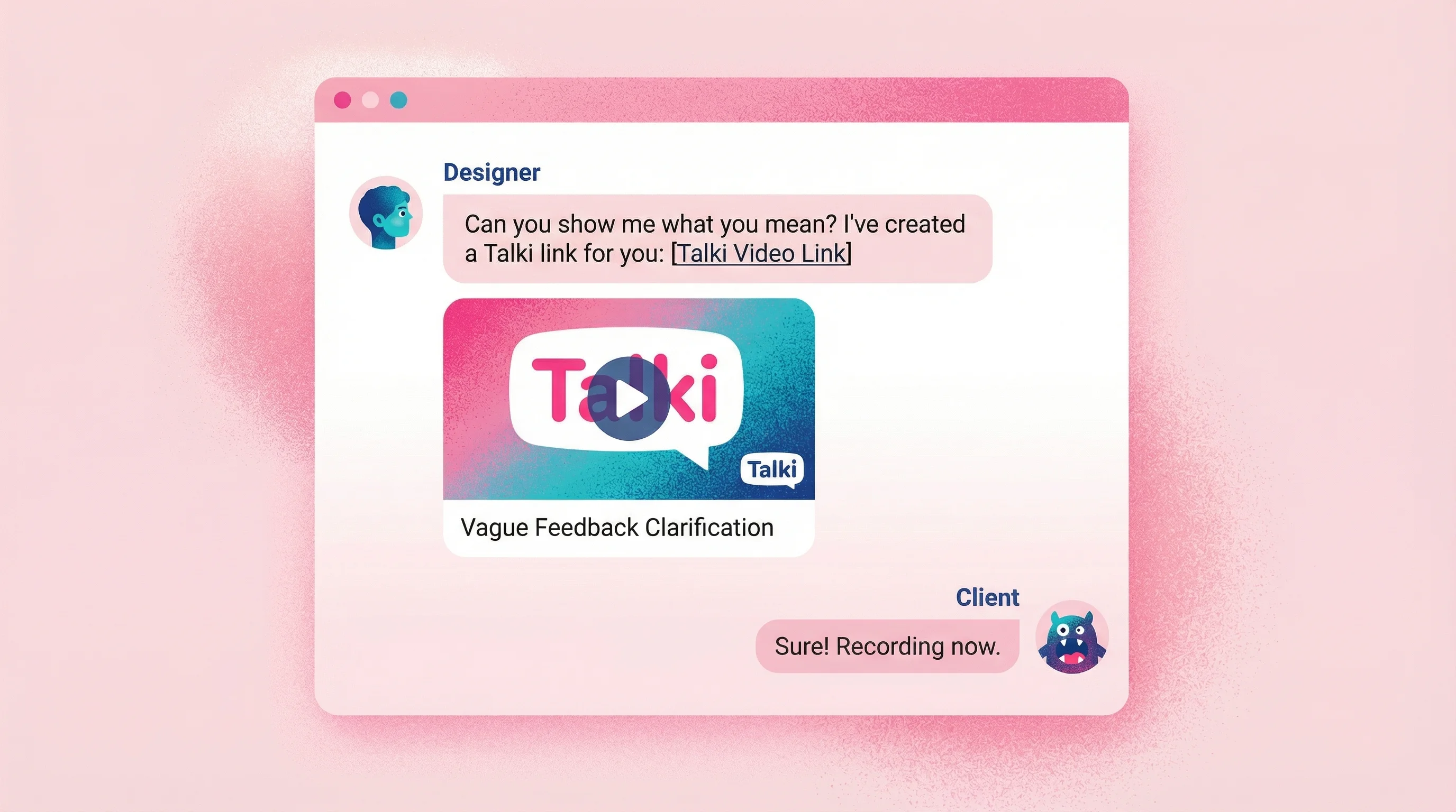
When clients record their screen while talking through their reactions, you capture everything written feedback misses: exactly what they're looking at, their tone of voice, the pauses that indicate uncertainty, and the pointing and gesturing that shows precise locations.
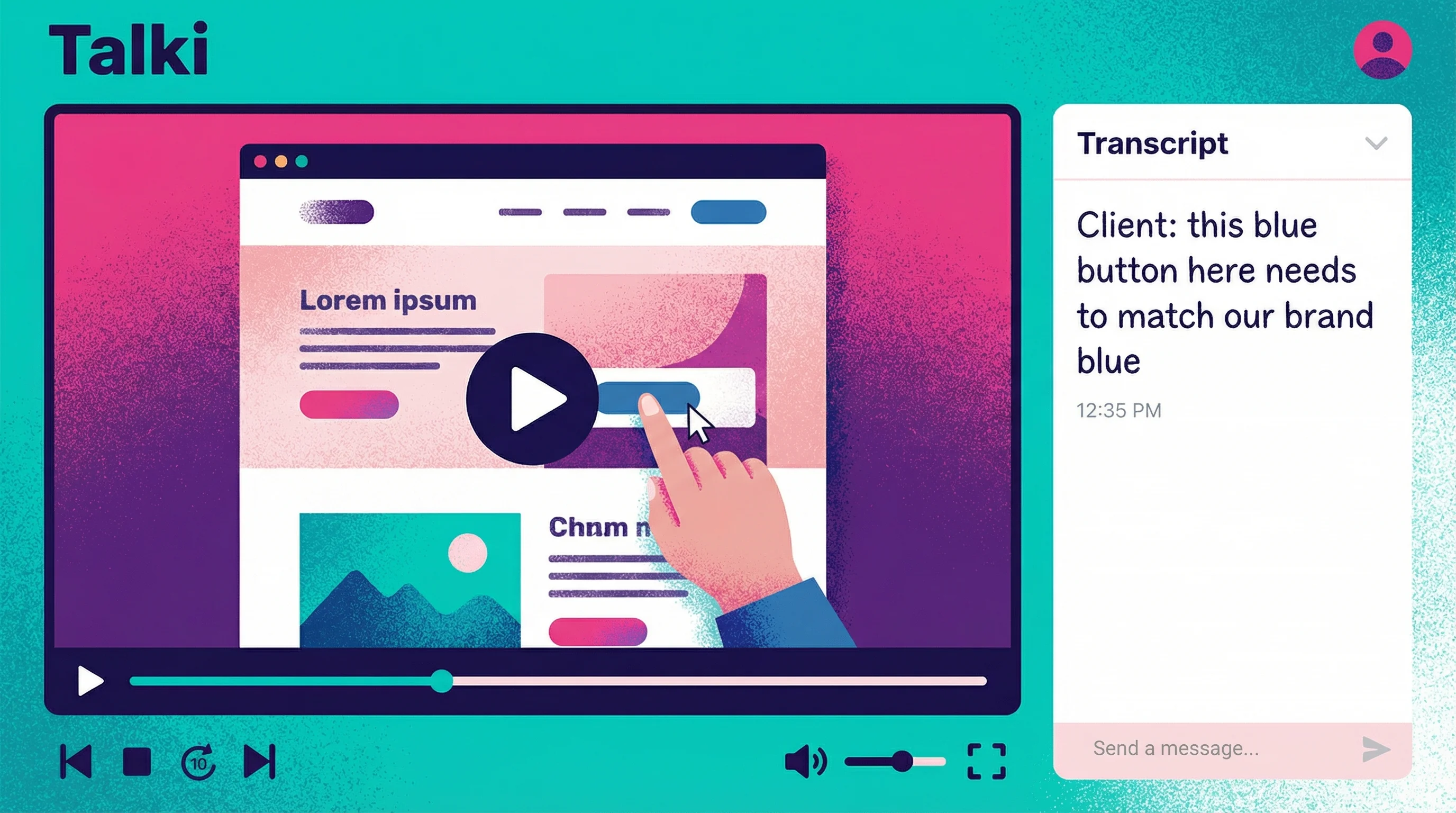
How it works: You send a link. The client clicks, sees your design, and hits record. They talk through their thoughts while their cursor shows exactly what they're referencing. No account creation, no downloads, no friction.
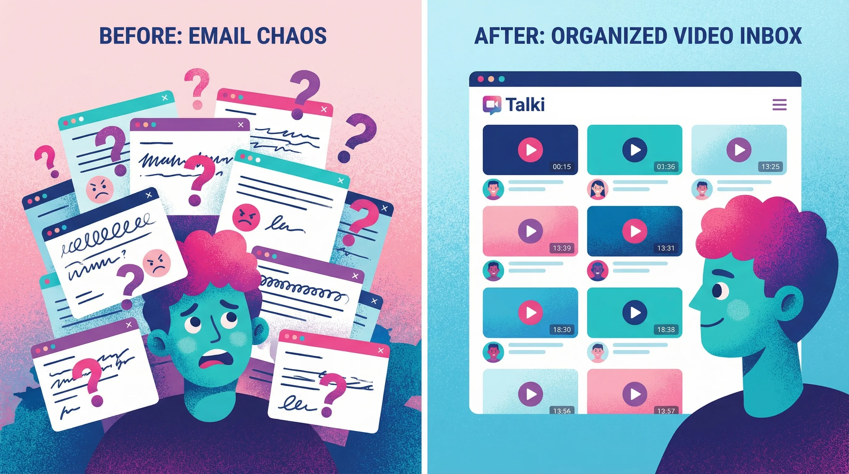
Tools that enable this: After years of watching this pattern repeat—first at agencies, then in my own creative studio—I built Talki to solve the asymmetric problem: designers need organized feedback, but asking clients to create accounts or install software kills response rates. The solution had to be dead simple for recipients.
If you're comparing different video feedback tools, the key criteria is recipient friction—tools that require account creation or software downloads see dramatically lower response rates. Talki is purpose-built for collecting video feedback without requiring recipients to have accounts or install software. The asymmetric model—easy for senders, organized for you—solves the friction problem that kills feedback collection.
Why it's effective: Video captures the pointing-and-explaining that happens naturally in in-person reviews. Instead of typing "the thing on the right feels weird," clients point at the exact element and say "this blue button—I think it should match our brand blue more closely."
Teams using video for design critiques report that it eliminates the need for annotations or stacks of screenshots to explain feedback context. Atlassian found that screen recording lets reviewers "walk through their thoughts" on the design, removing all guesswork about what they're referencing.
Video feedback also adds a human element that improves collaboration. Research shows that instructors giving video feedback were perceived as more supportive and personable—their video comments were longer and more encouraging, whereas text comments tended to be shorter and blunt. The same dynamic applies in client relationships: video conveys nuance, tone, and emphasis that text simply cannot capture.
Annotation tools
Letting clients click directly on designs and leave comments pinned to specific locations solves the "where exactly?" problem. Instead of describing locations, they simply indicate them.
Tools that enable this: Markup.io, Pastel, and native commenting in design tools like Figma all support visual annotation.
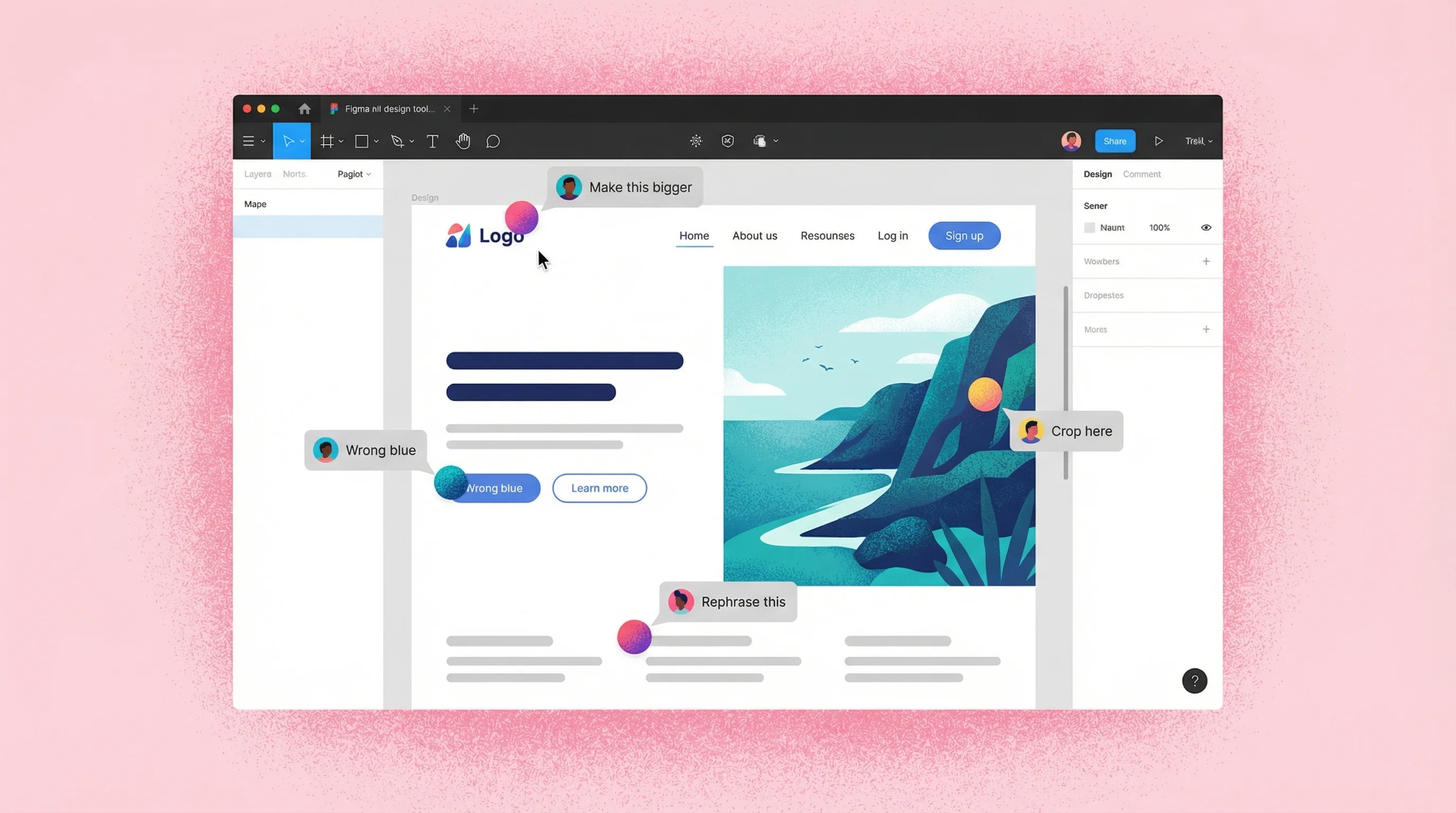
Why they work: Research on collaboration tools shows that visual annotations "make feedback visual and relevant. Instead of vague descriptions, you can point directly to the element" in question. When reviewers use point-and-click annotation to highlight UI elements, it "makes it much easier for them to pinpoint the exact design element they are referring to."
By providing a single shared space where comments are left in context, annotation tools streamline the feedback loop and eliminate the back-and-forth of clarifying "what do you mean by the header, exactly?"
Limitations: Annotation works well for specific, locatable issues but still requires clients to articulate their thoughts in writing. It solves the location problem but not the description problem.
For a comprehensive comparison of annotation tools, video feedback platforms, and other design feedback tools, including detailed pricing and feature breakdowns, check out our full tool comparison guide.
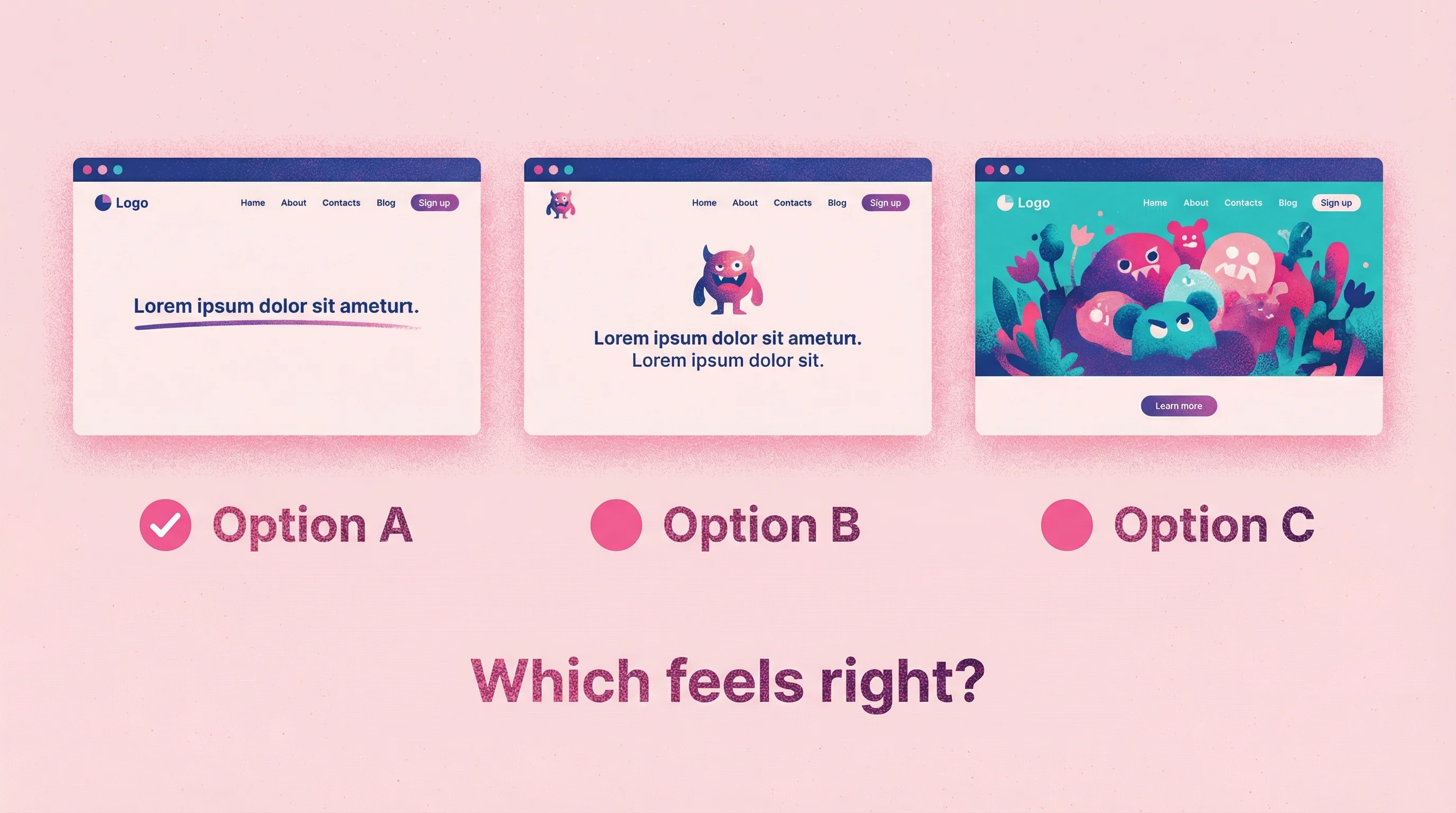
Comparative feedback
Instead of asking "what do you think?", present options and ask "which direction resonates more?" This shifts clients from description mode to recognition mode, playing to their cognitive strengths.
How to frame it: "Here are three directions for the homepage header. Which feels closest to what you're envisioning? Don't worry about explaining why—just pick the one that feels right, and we'll refine from there."
Why it works better: Nielsen's usability principles emphasize "recognition rather than recall." Users find it easier to select from given options than to generate ideas unaided. It's akin to a multiple-choice question being easier to answer correctly than an open essay question—the cues guide the response.
Comparative feedback also guards against the vague answers often seen with open prompts. If you just ask users broadly why they like or dislike a design, unmotivated participants may give very brief or generic responses. In contrast, questions that frame a clear comparison yield more concrete, actionable input.
Live review sessions
Sometimes synchronous feedback is the right call—particularly for major milestones or when you sense a client is struggling to articulate complex reactions. The key is using live sessions strategically rather than as the default for all feedback.
Research from Nielsen Norman Group notes that live design critiques are a cornerstone of strong design culture, but they typically occur at a set cadence or major project junctures. Fast-moving projects benefit from collecting feedback asynchronously on a rolling basis, reserving live discussions for resolving particularly thorny issues.
When to use live reviews:
Initial concept presentations
Major strategic pivots
Clients who consistently struggle with async feedback
Final approval before launch
When to avoid them:
Routine revision rounds
Small, specific changes
When scheduling delays would hold up the project
How to Set Up Feedback Processes That Work
Collecting better feedback isn't just about tools. It's about designing processes that guide clients toward useful input.
Set expectations early
In your project kickoff, explain how feedback will work and why. "We'll use video feedback for revisions because it helps us understand exactly what you mean. When you see the designs, just click the link and talk through your reactions—point at anything that catches your attention."
This framing prevents the "I'll just type a quick email" default that creates problems.
In my own practice, I started including a recorded video using Talki specifically for onboarding clients—in place of using a form. I include the questions I would normally put on a form in a Talki link and have clients answer the questions right there. This went from clients either not reading the onboarding instructions or simply not acknowledging them altogether, to now 4 out of 5 clients responding to the instructions on the Talki link. I get an email confirmation with their recorded responses, knowing they've completed it.
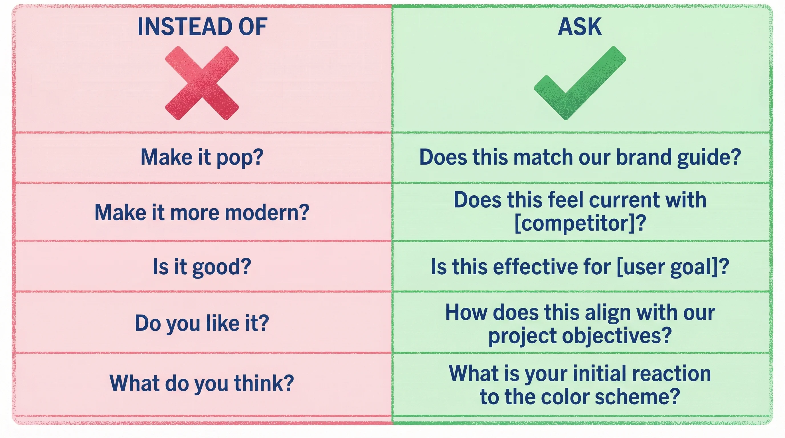
Ask better questions
Open-ended "what do you think?" invites vague responses. Specific questions guide clients toward useful answers.
Research consistently shows that targeted questions elicit more useful feedback than generic prompts. As one feedback expert notes, "'Tell us what you think.' About what?" If you need feedback on a particular aspect, you must spell that out. Making questions more direct increases both the quantity and quality of responses.
The most useful design feedback questions are tied to specific user tasks or design elements. For example, Southwest Airlines gained richer feedback by asking customers targeted questions right after key actions—like asking about the cancellation process immediately after a user canceled a flight. Contextually relevant, specific questions yield more focused, insightful responses than broad, open-ended prompts.
Create space for emotional reactions
Many clients feel they should give "professional" feedback focused on specific elements. But their emotional reactions are valuable data. Explicitly invite the gut-level response: "Before we get into details, what's your overall feeling when you look at this? Trust your instincts."
Separate feedback from decisions
Collecting feedback and making decisions are different activities. When you ask for feedback, make clear you're gathering input—not asking for final direction. This frees clients to share reactions without feeling like every comment commits them to a path.
Research on design critique methods emphasizes this separation. Figma's design team explicitly formalized it, clarifying that critique sessions are for generating ideas, surfacing issues, and exploring possibilities—not for making product decisions on the spot. When people know a feedback meeting isn't where final judgments will be passed, they're more comfortable offering honest opinions and creative suggestions.
This approach prevents dominant voices from shutting down the feedback process and gives designers time to properly consider all input before making reasoned decisions. The result is more coherent decisions and better-designed products.
Design Feedback Examples and Questions
To help you implement these principles, here are concrete examples of how to ask for design feedback in different scenarios:
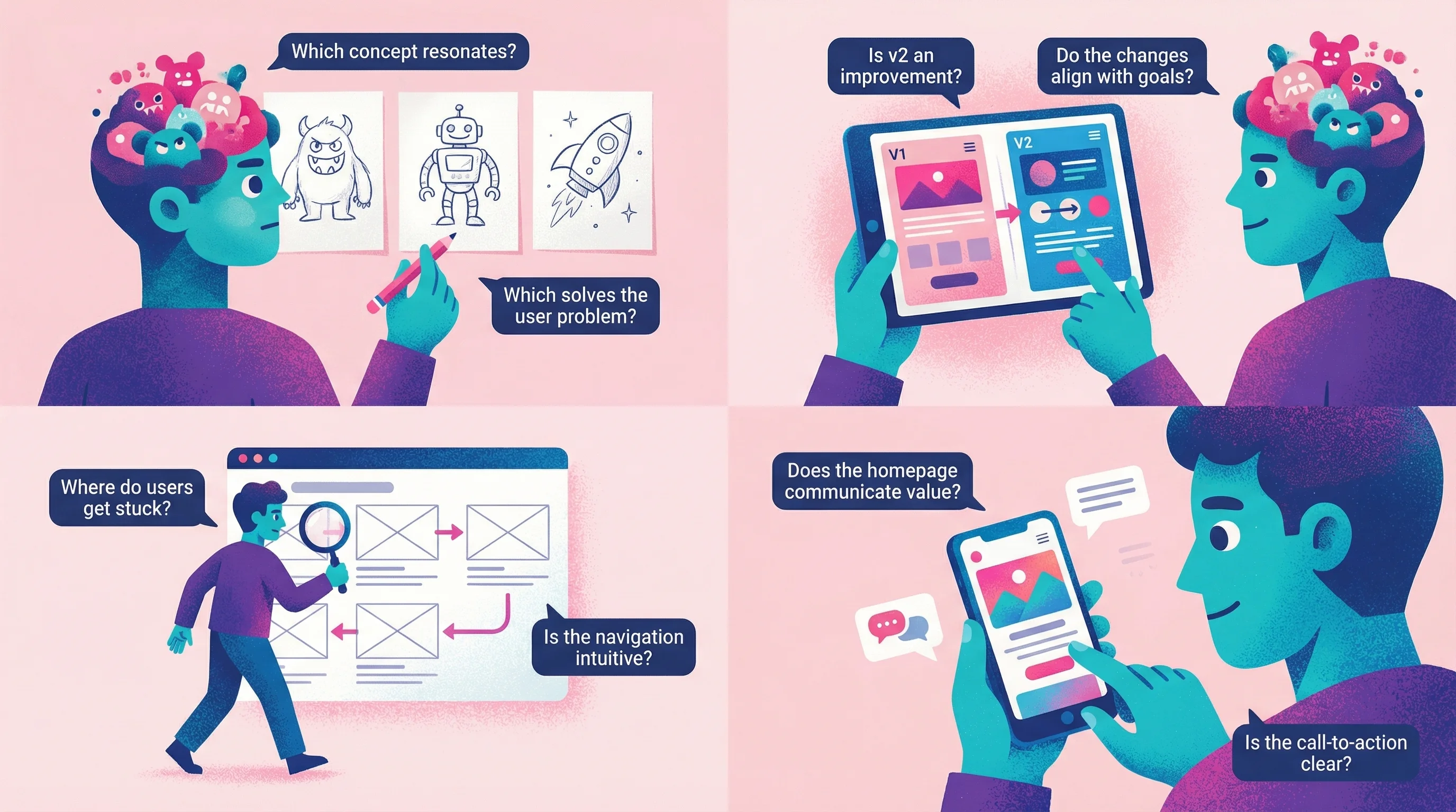
For initial concept reviews:
"Which of these three concepts feels most aligned with your brand personality?"
"What emotions do you feel when you first see each option?"
"If you had to explain one of these designs to your team, which would be easiest to describe?"
For iteration feedback:
"Compared to the previous version, does this feel like we're moving in the right direction?"
"Point to the specific area that still doesn't feel quite right."
"What's the one thing you'd change if you could only change one thing?"
For UX design feedback:
"Walk me through how you'd expect to complete [specific task] using this interface."
"Was there any moment where you felt confused about what to do next?"
"Which parts of the experience felt natural versus which required extra thought?"
For website design feedback:
"Does this homepage make it immediately clear what we do?"
"Which section catches your attention first? Is that what you'd want people to focus on?"
"If you were a potential customer, what questions would this page answer versus leave unanswered?"
FAQ
How do I respond to vague feedback like "make it pop"?
Don't try to guess what they mean. Send a quick video or voice message asking them to show you: "I want to make sure I understand—can you point at the specific area that feels flat to you?" Tools like Talki make it easy for them to record a quick response showing exactly what they're referencing.
What if clients insist on written feedback?
Meet them where they are, but structure the request. Instead of an open-ended "send your thoughts," provide a simple template: "1) What's working well? 2) What feels off? 3) What's one specific change you'd make?" This guides them toward more useful responses without requiring new tools.
How long should I wait for feedback before following up?
For async feedback, follow up after 48-72 hours if you haven't heard back. Longer gaps suggest the client is struggling with the cognitive load of formulating feedback—a signal to offer a different method like a quick call or video exchange.
Should I push back on feedback I disagree with?
Yes, thoughtfully. Your job includes guiding clients toward solutions that work, not just executing whatever they request. Frame pushback as exploration: "I hear that you want bolder colors. Can you help me understand what you're hoping that will accomplish? I want to make sure we solve the underlying need."
How do I improve the design feedback process with my team?
Start by establishing clear norms around when to use different feedback methods. Document your process—which tools for what types of feedback, expected turnaround times, and how feedback will inform decisions. Most importantly, separate the feedback collection phase from decision-making to create psychological safety for honest input.
Conclusion
Design feedback fails when it forces visual thinkers to communicate through text. The fix isn't teaching clients to write better—it's giving them methods that match how they naturally react to design: pointing, showing, comparing, and explaining out loud.
The research is clear: recognition beats recall, visual context eliminates ambiguity, and lower cognitive load means faster, better feedback. Whether you're seeking UX design feedback, website design feedback, or just trying to understand what "make it pop" actually means, the solution is the same—make it easy for people to show you what they mean instead of struggling to describe it.
Start with one change. For your next project, send a video feedback link instead of asking for written comments. You'll be surprised how much clearer the input becomes when clients can simply show you what they're thinking.